

Designing how Amazon’s first Alexa photo frame looks, listens and talks back
Problem
Our best memories are stuck in our phones. Even when the photos survive, the stories behind them fade, and finding one moment means scrolling through years.
Solution
Keep the photo first and add two ways back into a memory. Voice Notes save the story behind a photo in the voice of loved ones, and Alexa finds any moment you describe.
Impact
The Photos org’s first 0-to-1 device, launched in the US on Oct 28, 2026. In beta, satisfaction rose from 5.83 to 6.34 out of 7, and side-by-side pairs reached 96%.
Responsibilities
Lead designer for the frame’s touch and Alexa interactions, and Voice Notes
Team members
2 product managers, 3 designers, 1 researcher, 100+ engineers
Status / Duration
Launched / 13 months
Memories live all around us

Jane's phone holds years of photos of her kids, Lucy and Patrick.
She sends a few to her mom whenever she remembers.


16,123 photos of the kids since 2018

Lucy, 4

Patrick, 8


Haven’t sent mom the kids’ photos in a while…


Three states away, Grandma Sue sees only the photos Jane remembers to send, and she wishes she could see more.

I wish I could see more of Lucy and Patrick…

3 states away

But the stories behind them get lost
Jane sends a few photos from bike day.
Sue sees Lucy on her new bike, but not the story behind it.
Did she make it all the way by herself?

All Sue got: "Bike day!"
A week later, bike day is buried under everyday texts. The memory fades, while Sue's frame still shows a photo from years ago.
the same photo since 2022
Sue's shelf


bike day,
buried under
a week of texts
How might we...
bring buried photos back into everyday life, so families can rediscover them naturally and remember the stories behind them?
1 · INTRODUCING ALEXA PHOTO FRAME
Jane sends Sue a frame. Sue plugs it in, and her family is already there.
Customer delight: Nothing to set up on Sue’s side. The photos Jane picked are waiting the moment it turns on.
What I designed: Voice note playback on the frame, so a message from Jane can greet Sue along with the photos.
2 · FIND YOUR FAVORITES, FAST
“Alexa, show me Lucy growing up.”
Customer delight: Sue just asks, and Lucy's first nap to first swing appears in seconds.
What I designed: Where “More like this” lives in Discovery mode, and the first pass of mosaic search results.
3 · PHOTOS YOU LOVE, ALWAYS IN SEASON
Most of the day, it’s just a photo
Customer delight: Looks like a frame from across the room. Photos pair up and follow the seasons.
What I designed: Ambient and Discovery modes, side-by-side pairs, and the rule for where actions sit on a photo.
4 · SHARE THE STORY BEHIND THE PHOTO
Three states away, Sue hears it in Jane’s voice.
Customer delight: Jane records the story on the photo. When it shows up on Sue's frame, she taps to listen.
What I designed: Voice Notes on the frame: recording, playback and the new-note alert.
5 · FAVORITE PHOTOS SHARED BY OTHERS
Sue taps the heart, and Jane knows.
Customer delight: When Sue favorites a photo, Jane hears about it. A small tap becomes a moment together.
What I designed: Where Favorite sits in the information architecture, and how it works by touch and by voice.
Process: Discover and Define
Team workshop to kick it off
Sep 22, 2025 · Product, design, research, motion and engineering in one room for a day

What came out of the day
What we learned
-
A frame isn’t an Echo Show: people want a simple, single-purpose device for displaying photos.
-
One person runs it, often from afar, so setup and management on mobile must be easy.
-
Photos bring the household together and bring back memories people had lost.
What to dig into next
-
The whole out-of-box experience, including gifting and unboxing.
-
Phone-to-frame handoff for setup and management.
-
Manage photos, voice notes and favorites: which belong on the frame, which in the app.
What to keep
-
Photo-forward, with few interruptions or prompts.
-
Premium and tactile, less “digital”.
-
Alexa when you need it, out of the way when you don’t.
-
Simple setup: conversational onboarding that brings the aha moment early.
Next steps & ownership
-
Setup and management journey · mobile designer
-
Design principles · Xiling and mobile designer
-
Research · Xiling and researcher
-
On-device journey · Xiling and 2 product managers
Define design principles based on user data
Four principles, each backed by the research below
Photos are the hero
Every photo, center stage. Ambient shows only the photo, unlike Echo Show, with no clock or metadata on top.

More than a frame
Alexa works quietly in the background and steps in when needed. Looking for a favorite photo? Just ask.

Earned exceptions
Two things earn a spot: a new voice note, to celebrate the aha, and the Alexa mute indicator, to build trust.

build trust
celebrate the aha
Curated, not chronological
Each day brings a fresh set: the best shot of each moment, what matters today, and pairs that show how people have grown.

Supporting research for "Photos are the hero"
Three studies, one answer: photos come first.
14 of 14 valued seeing photos most. People asked for a frame, and an Alexa, that stay out of the way.


P1 · In-depth interviews
n=17 · Oct 2025
I like that it is digital but I don't want it to look digital.

P7 · Alexa on the frame
n=10 · Feb 2026
I want Alexa to be as minimal as possible. I want photos to stand out most.
Supporting research for "Earned exceptions"
Five studies, one answer: only two things earn a spot.
12 of 12 gift sessions peaked on the voice note. 82% of beta users never saw mute feedback that only shows on interaction.
Called the voice note the peak of the gift
100%
n=12
Asked for a marker showing which photos have a voice note
38%
n=94
Beta users who didn't notice the mute feedback in Ambient
82%
n=28
P1 · Voice Notes study
n=40 · Oct 2026
I would never know there was a voice note unless I clicked into every pic to look for the symbol.
P6 · Pre-beta study
n=9 · May 2026
I figured out why Alexa wasn't working. I had muted it when trying to get out of settings.
Supporting research for "More than a frame"
Three studies, one answer: voice is what sets the frame apart.
Voice search added +$19, the most of any software feature; only screen size and camera, both hardware, ranked higher. People named it as the one thing other frames don't have.
Added willingness to pay, by feature
How much more customers would pay for each feature · PRFAQ research · conjoint · 2024

P8 · In-depth interviews
n=17 · Oct 2025
Everything here I expect to already be in a digital frame… but the one that stands out is voice assistant.
P1 · Pre-beta diary
n=9 · May 2026
The kids loved asking it to pull up certain themed pics.
Supporting research for "Curated, not chronological"
Three studies, one answer: a curated set beats everything in order.
96% were satisfied with side-by-side pairs. People want the frame to know them, not to show every shot they took.
Satisfaction with side-by-side pairs
96%
n=125
Rated the freshness of what the frame shows
6.45/7
n=47
Valued seeing automated memories
13/14
n=14
P1 · In-depth interviews
n=17 · Oct 2025
AI has to get to know you… Curating for me, detecting memories, recognizing faces.
P8 · Usability study
n=12 · Apr–May 2026
On a trip I take multiple photos of the same thing. I wouldn't want it to add all those photos to the frame.
Iteration 1 · Top touch bar
Overview
For the first few weeks, I designed around a touch bar on the frame's top edge, so fingers never smudge the photo and the frame still reads as a frame, not a tablet.
What customers told us
Customers want the app for setup, settings and sharing. On the frame they mostly just look, and when they act, it's a quick touch. Search they'd rather say than tap.

Three taps and a swipe
So the bar holds only the quick actions: swipe for next or previous, and one tap each for Favorite, Details and notes, and Hide. Search sits behind a long press, with voice as the main way in. Share and settings stay in the app, and volume and mute get their own buttons.

Touch bar · Single tap: basic actions
One tap on the top bar shows three actions, each a single tap that ends back on the photos:
- Favorite: the frame shows this photo more often.
- Notes: the photo flips over, and you can add a voice note with Alexa.
- Hide: the photo leaves, and you can tap again to undo.
Touch bar · Long press: go deeper
Long press the touch bar on any photo, and the frame suggests ways to see more. Swipe to browse, tap once to play.
- How it finds them: it looks at who's in the photo, where and when it was taken, and what's in it, then pulls related photos from the library.
- What you see: suggestions show up one by one as each search finishes.
- Examples: "More from this day" and "More outdoor photos". Real suggestions depend on the photo on screen.
Iteration 2 · Touchscreen: early concepts
Why we moved from a touch bar to a touchscreen
We moved to a touchscreen on Oct 20, 2025. In customer interviews that month, people found the touch bar less intuitive than a touchscreen: they couldn't tell which spot did what, or how long to press. They expected to touch the photo.
Competitor analysis
Aura: No touchscreen. Every action lives on a touch bar along the top edge, taught one gesture at a time.

Frameo: A clock that never leaves the screen. Tap for a menu card at the top; reactions land as hearts on the photo.

Skylight: A heart that never leaves the photo. Tap for a menu bar across the top; settings live in one long form.

Nixplay: Unlabeled icons. Tap for an icon row at the bottom; setup starts on the frame and finishes in the app.

Patterns from competitors
Actions at the top
Skylight, Aura and Frameo put actions along the top. On an upright frame, that's the edge a hand reaches first, clear of the photo.

Photos that connect
When family shares a photo, the frame shows who sent it and lets you like it back. A display becomes a two-way line to family.

One gesture each
Swipe to view photos, double-tap to favorite. Hiding takes a second step, so a stray tap never loses a photo.

Essentials on the frame
Settings about the frame itself, like brightness, sleep and Wi-Fi, are right on the frame and easy to find.

Early ideas: what a tap on the photo opens


Why these ideas didn't make it
These sketches turned a tap on the photo into a dashboard: notes, related collections, people and metadata all at once. The problems:
-
The photo stops being the hero. In most sketches, Photo A shrinks to a tile among other tiles.
-
Related collections aren't instant. They take a couple of seconds to generate, so the screen would load in pieces.
-
Most photos have no voice note and few related collections, so the layout would often be half empty.
-
Gift recipients, our key persona, are often 65+ and less tech-savvy. One tap shouldn't reveal too many new concepts.
-
A frame, not a tablet. People mainly want to swipe to the next photo, and a grid gets in the way.
Iteration 3 · Touchscreen: two modes, one photo queue
Ambient mode
Just the photo, the way a frame should look. Photos advance on their own, and a swipe moves to the next one. Tap anywhere, or say "Alexa", to start interacting.
Discovery mode
Tap, and the photo steps back into an album-like queue. Swipe to browse; tap or wait to go back. Actions that apply to everything sit on top; actions for one photo of a pair sit on that photo.
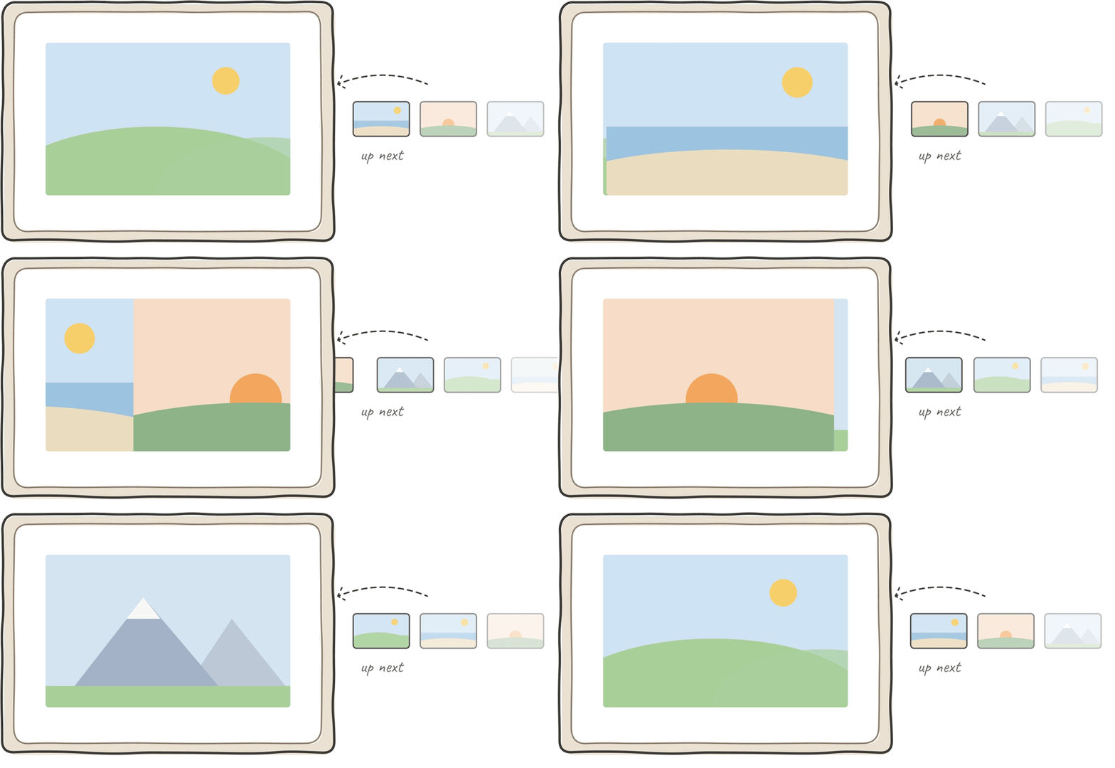
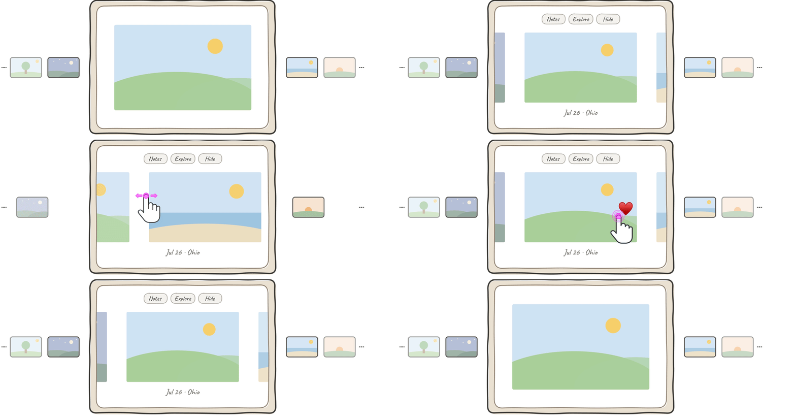
Visual language: analogue soul, digital capability
Photos treated like prints worth keeping: paper, white space and quiet type, at home in a living room, with just enough digital to bring them to life. Captions lead with the date, like “Dec 3, 2025 · Lisbon,” because people glance rather than read, and videos play muted because the frame lives in a shared room.

Your voice, written on the back of the photo
Record a voice note on any photo. It becomes a handwritten memory you can play back.
Explore: from one photo to a slideshow
One tap turns a photo into collections, and a slideshow that starts from the photo you choose.
Hide: one tap keeps a photo off the frame
Some photos are fine in your library but not right on the frame. Tap the photo, then tap Hide. The photo slides away and the next one moves in. It stays safe in Amazon Photos, so you can unhide it whenever you like.
Iteration 4 · To launch: leadership feedback, engineering limits and a visual refresh
Main change 1: Voice first, no transcript, many notes per photo
Overview
At the Jan 12, 2026 CX review, the team agreed that the voice, not the text, is what makes a note feel personal. We dropped the transcript and let one photo hold several notes from different people.
What it means for design
Two surfaces, two jobs. The back of the card stays, now as the list: every note on a photo, who left it and when. Recording and playback move to an immersive full-screen view over the photo, with large controls and nothing to read, so the voice and the photo share the whole frame.
Final voice note design after a few iterations
Main change 2: No double-tap to favorite
Overview
We removed double-tap to favorite on Apr 21, 2026. To tell a single tap from a double tap, the frame had to pause after every tap, which slowed the switch between Ambient and Discovery in both directions.
What it means for design
One tap, one meaning. A tap now switches between Ambient and Discovery immediately, with no wait. Favorite moved off the gesture: at launch you favorite your own photos by voice, and a visible Favorite is planned for Day 90, once shared photos can be favorited.
Final favorite design after a few iterations
Main change 3: Confirm before Hide, no Undo
Overview
Customers asked for Undo, and design proposed a 6.5 s Undo snackbar on Jun 18, 2026. Engineering pushed back: Undo is harder to build than a confirmation, had no slot before launch, and voice hides would need it too. On Jun 23 we chose a confirmation step instead.
What it means for design
The safety net moves from after the action to before it. Tapping Hide now asks first: "Hide from frame? Unhide later in Amazon Photos app." Shared photos get a stronger warning, because they can't be unhidden. Hiding by voice skips the question, and afterward owned photos show where to unhide. It shipped on time, and Hide scored 6.12/7.
Final hide design after a few iterations
Main change 4: Visual refresh
Overview
In July 2026, another designer and I refreshed every key screen, from Ambient and Discovery to Voice Notes, Settings and errors, with sign-off from leadership.
What changed
Contrast drove the refresh. The layouts stayed; surfaces, buttons and colors changed. Textured paper became a flat warm color, the top buttons became 60% white for 7.03:1 contrast, buttons on photos got a darker background, and a single accent color marks what’s new.
Before


After


Main change 5: A persistent Alexa mute indicator in Ambient
Overview
Ambient was designed to show nothing but the photo. In Feb 2026 research, 8 of 10 participants preferred seeing mute only when they interact. But Alexa leadership required a persistent indicator, and beta data backed it: 82% of beta users missed the mute feedback in Ambient (Aug 28), and mic-off understanding scored 5.28 against a 5.5 bar. So when the mic is off, Ambient now shows it by default, with an “Always show the mute icon” setting families can turn off.
What it means for design
One of only two earned exceptions to "photo only". A small mic-off icon sits in a top corner, sized and toned to be glanceable without competing with the photo. On mute, a short label explains it for 6 s, then only the icon stays. Research suggested at least 10 s; we kept 6 s because the text is short.
Final design after a few iterations
Customer impact and reflections
Impact


Reflections
Minimal, but still usable
Text-only actions, inspired by paper photo albums, read as labels rather than buttons on the frame. They became soft, tappable buttons.

The screen has the final say
A paper texture looked warm in Figma but didn't render as intended on the device. After testing options on the frame, we chose a solid background.

Quiet, but never unclear
I first kept the mute indicator off Ambient so nothing covered the photo. Some customers couldn't tell if the frame was muted, so a small indicator now stays on.

One frame, many apps
Setup, Settings, Ambient and Discovery, and voice note playback are separate apps. I checked feasibility with each team early, before designing across them.


